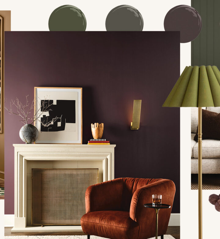
The Restorative Dark Color Trend Is Coming for Us All This Fall

It’s surprisingly soothing

PureWow editors select every item that appears on this page, and some items may be gifted to us. Additionally, PureWow may earn compensation through affiliate links within the story. All prices are accurate upon date of publish. You can learn more about the affiliate process here.

restorative dark colors in rooms
Sherwin-Williams/TOV Furniture/Magnolia

The start of fall is like seeing Dakota Johnson dye her hair and wondering if you should go “glossy espresso” (or get bangs) too. As soon as the leaves start to change and the PSLs hit Starbucks menus, you may start dreaming of a moodier vibe. Darker, cozier colors that ease your transition into sweater weather.

You have to pause and ask yourself whether it’s just a phase—something you’ll love from September through the holidays, then start to find cave-like and dreary come late January, when the days are still short and the slushy snow outside has lost its early winter charm.

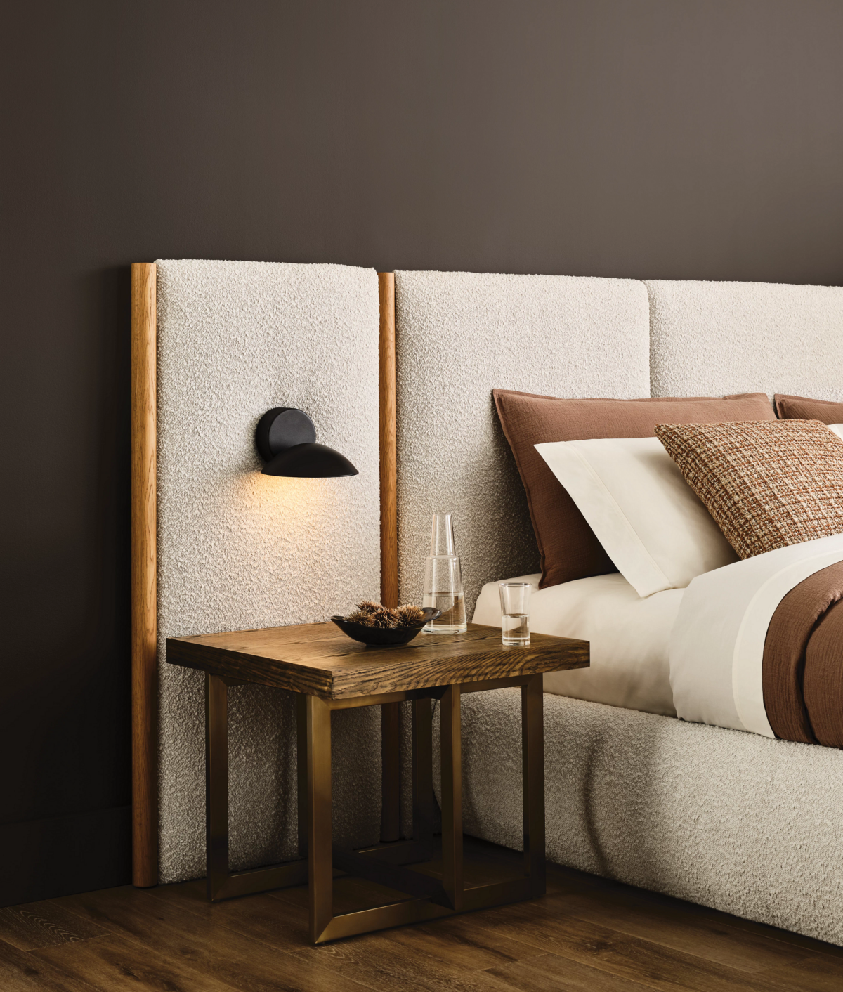
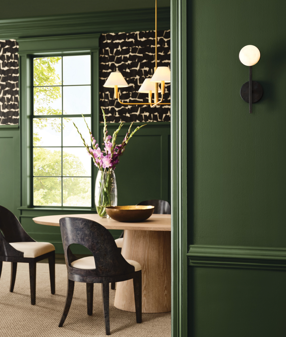
But what if it’s not a phase? What if you can’t stop liking and pinning and dreaming about dramatically navy cabinets and deep ochre accents and hunter green velvets? You’re ready to lean into the Restorative Dark color trend, a movement Sherwin-Williams coined in its 2026 Color Forecast that has been slowly gaining traction. It’s the idea of combining deep, “nocturnal colors” to create relaxing spaces that help you escape the frenzy and demands of the outside world.
Magnolia Home x Loloi

“Originally, when we started thinking about dark colors being restorative, you’re like, ‘Really? That doesn’t seem logical. Spas are like light blue and sages,’” Emily Kantz, Color Marketing Manager at Sherwin-Williams, told me. “But when you think about it, those darker colors are so comforting. I suffer from migraines, so I just want to go in a room that’s like, as dark as can be.”

Restorative Dark colors all have darker values, reflecting less light and being gentler on the eyes overall. They’re more muted in nature, so they’re less likely to stimulate your senses, creating a sense of tranquility. We’re starting to see this evolution in wellness too, Kantz says. Picture the design of Aire Ancient Baths and Othership in New York City; even the dark-screen design in the Oura app.

sherwin-williams

These darker shades can be grounding, but overdo it, and your room may require a headlamp to walk through it. That’s why Kantz recommends applying this palette to spaces with great natural light and taking a layered lighting approach—a mix of ambient, task and accent lighting, ideally with dimmers—so you can adjust the room to suit your needs.

“You might want different light levels throughout the day,” she says, so “if you wanted to go dark and moody you could, but if you didn’t, you can [brighten things up].”

She also recommends testing things out in a small space, such as a powder room, hallway or nook, for an unexpected twist that doesn’t take over your whole home. (A hallway can be especially great, particularly if it’s an area where kids kick off their shoes and bags, as it can hide scuffs and marks easier.)

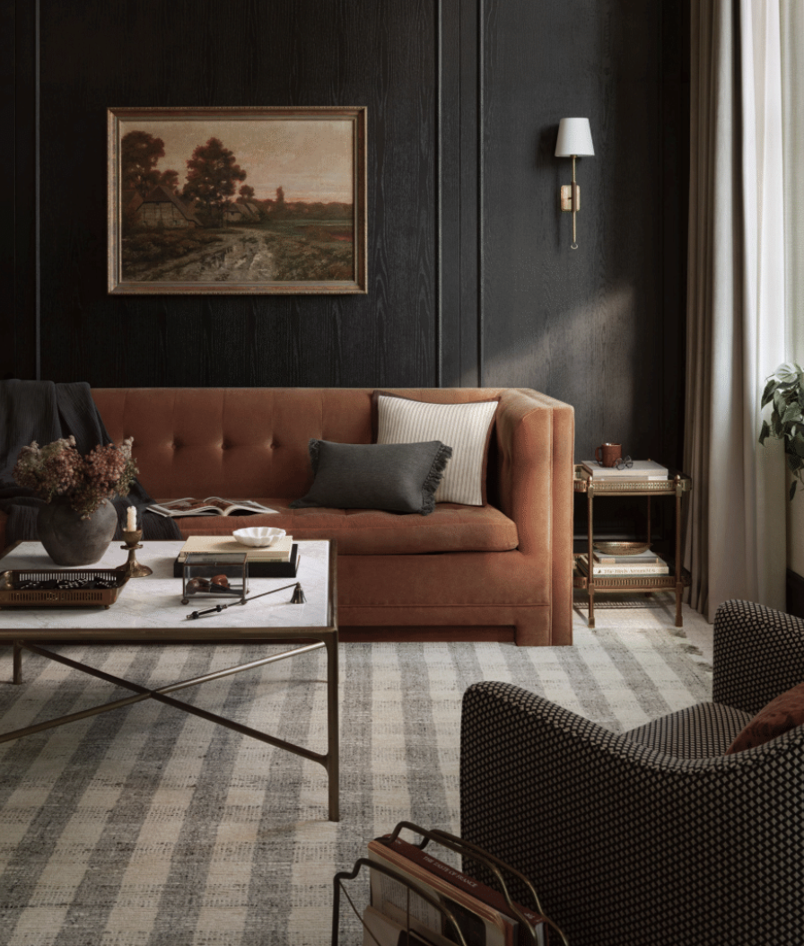
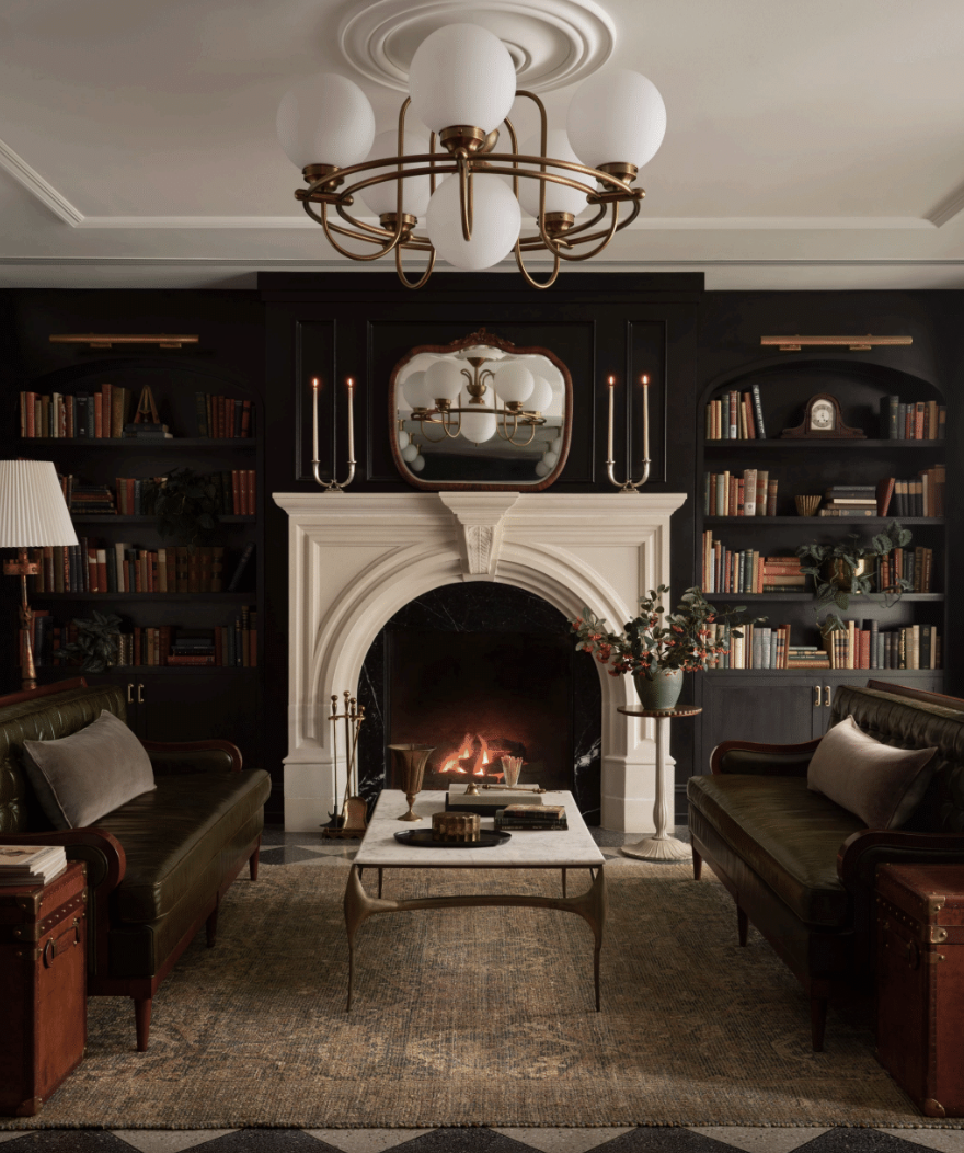
leather sofa and checkered rug in living room

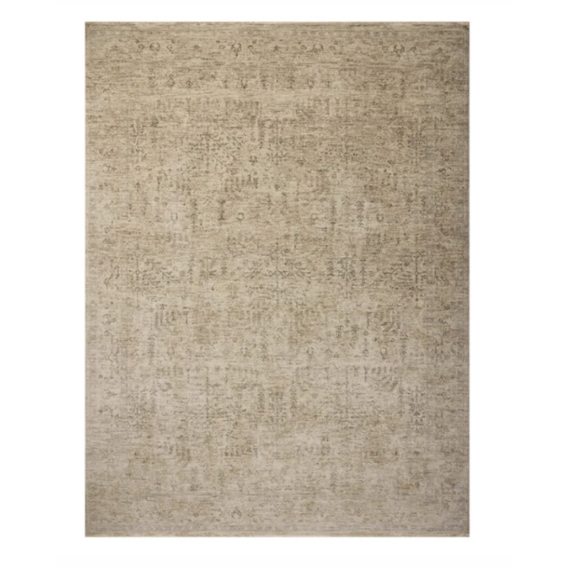
A lighter-colored rug can also provide balance. Its woven texture won’t reflect light, adding to that cocooning, sanctuary-like effect, without skewing the room too dark. (For proof, simply see the Magnolia Home x Loloi fall 2026 line, which paired jute and wool rugs from the Merritt and Oakley collections with sumptuously dark interiors.)

As for which colors to choose, that depends on your tastes, but as Kantz looks to 2027, she sees some of the most popular Dark Restorative shades evolving.

As certain colors have a moment—like cherry red and butter yellow—they’ll start to appear as undertones in other colors. Browns, for example, are getting more of a reddish undertone. Kantz cites two colors from its 2026 forecast—Rojo Marrón and Sable—and how they’ve “blended.” Bitter Chocolate is more of a middle ground between the two, a color Sherwin-Williams predicts will be big in 2027 and beyond.

sherwin-williams

Similarly, yellow’s popularity has led to the rise of colors with it as a more prominent undertone (fans of Relic Bronze may start to favor Eminent Bronze, for example). It’s proof that if you find darker colors soothing, you can still make them feel fresh—or work in flourishes of that buzzy color without having them clash with your more dramatic backdrop.

As for getting Johnson's hair? Well, you’ll need to consult with your stylist on that one.


candace davison bio

Candace Davison

VP of editorial content

  • Oversees home, food and commerce articles
  • Author of two cookbooks and has contributed recipes to three others
  • Named one of 2023's Outstanding Young Alumni at the University of South Florida, where she studied mass communications and business